Paranormal Activity
The Main image of the Poster is of the 2 main protagonists within the feature. The image is a high-angled wide shot of an image which is distorted through a night-vision effect mainly utilised on handheld cameras, it is also screen capture from within the film which is used as the films Theatrical Poster. This style is a significant convention of the Horror Genre as multiple films inhabit the idea of using a screen capture as a Film Poster (e.g. 'The Strangers' & 'Quarantine'). The film was shot in a cinema verite style which makes the feature seem as if it was shot through a hand-held camera, utilising the idea of the 'un-stable camera'.
The 'Title' of the film is stylised through the idea of white noise and emitting a distorted effect on the letters to connote to the theme of the feature 'paranormal'. The colour 'Red' instigates the idea of danger and fear which are some of the main themes dealt with in the film. It also contrasts to the black background to make the text stand out to the audience. The captions used "What Happens When You Sleep?" & "Don't See It Alone" are stylised in the same way as the title of the film, yet without the white noise effect. These slogans used are what draw the audience to go and see the film as it brings up a question which get audiences contemplating the answer and making them want to go and see the film to find out 'the answer'. The "Don't See It Alone" creates the fear factor for the film, again making audiences want to go and see the film.
The location of the image is within a household as we can see that the protagonists are vulnerable and in fear within a bedroom, making the action seem much more realistic.
For this film specifically, the main audience would be 18-30 year old people as the fear factors of the film are something which would not appeal to a younger audience. Also, the idea that the events which occur within the film are events which could happen in real life, which makes the film more appealing and fearful to see.
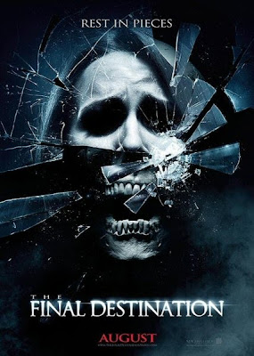
The Final Destination

The main imagery of the poster is somewhat of a Young girl illustrated through a Close-Up shot. It is distorted through a 'Smashed Glass' effect with the bottom half of her face manipulated to seem as if she has no skin, and half a skeleton head. This connotes that the film may be gruesome as it insists on the idea of a "Face being smashed" or "Breaking" plays on the idea that the film is a part of the Horror category. The Special Effect utilised splits the picture through the central fold of the image, separating the different effects. The Poster uses dark and dank colours combining Black, White, Greys and Blues to create this distorted and sinister tone to the films.
The Tag-Line for the Movie is "Rest In Pieces", a play on the phrase "Rest In Peace" which strongly connotes to the theme of Death. The capitalised lettering coloured in 'White' is set onto a black backdrop to highlight the phrase to the audience. It accentuates the gruesome occurrences within the film and strongly links to this as well as confirming the Horror Genre in which the film is placed within.
The Age Rating for this Film is not labeled on the Poster as it would negate attraction to the Film for a wider range of Audiences if there was a rating specified. Although, this film clearly apart of the Horror Genre for its somewhat graphic imagery featured on the Poster, it is definitely not suitable for a younger Audience. The main Fear Factor for watching this Film would be the gruesome imagery it already emits and perhaps the gore which could be featured.
The Ring

The main elements of the Mainstream Poster is the obvious point that it does not feature any people on it. Instead, it is an image of an disorientated, glowing white ring which seems to be manipulated by a 'White Noise' effect, placed on a black background to emphasise this. A typical convention for a film within the Paranormal Horror Genre catalogue as it is obvious for the audience that the film is of paranormal theme due to the effects on its poster imagery and text. The lack of people on the poster hints at its supernatural elements.
The poster features very little on it so it is easier to catch the idea of the film just at a glance (e.g. on the side of a Bus). This could also be so that not much of the plot is given away and gets its audiences asking questions such as "What is 'The Ring'?", making audiences more likely the research it or even go and watch it for themselves.
The tagline "Before you die, you see..." adds to the stereotypical elements of a Horror Genre Film as it concerns the theme of Death and accentuates this to its audience. Again, it brings up numerous questions for the Audience to want to know the answers to (e.g. "Do you Actually see the Ring?" & "What does the Ring symbolise?"), so it makes them want to go and see the film even more. The style of the tag-line for the Film follows the theme of 'White Noise' manipulation and a disorientated effect, accentuating the paranormal elements.
The rating for this film is not specified, from studying the Film poster it seems as if the film would appeal from a Teenage to a Young Adult audience for both Boys & girls as their minds are not as matured as an adults and gets them more frightened, worked up and questioning the film. Maybe even letting it effect their everyday lives. The fear levels of the Film would not make this appealing for younger audiences whatsoever as it emits terrifying elements which may leave them reeling after seeing the film.


No comments:
Post a Comment